myCourses connects university students and professors on a course and task management platform to communicate, share resources & track performance.
College Project
Research
UX/UI
Visual Design
12 Weeks, Fall 2016
CONCEPT
Insight
myCourses complicates the ability to efficiently communicate, access necessary content, and utilize important features. This reduces student interest, engagement, and success rate.
Challenge
RIT is a career-oriented institution with a need to renew outdated processes and implement engaging educational tools for students to confidently excel with.
Solution
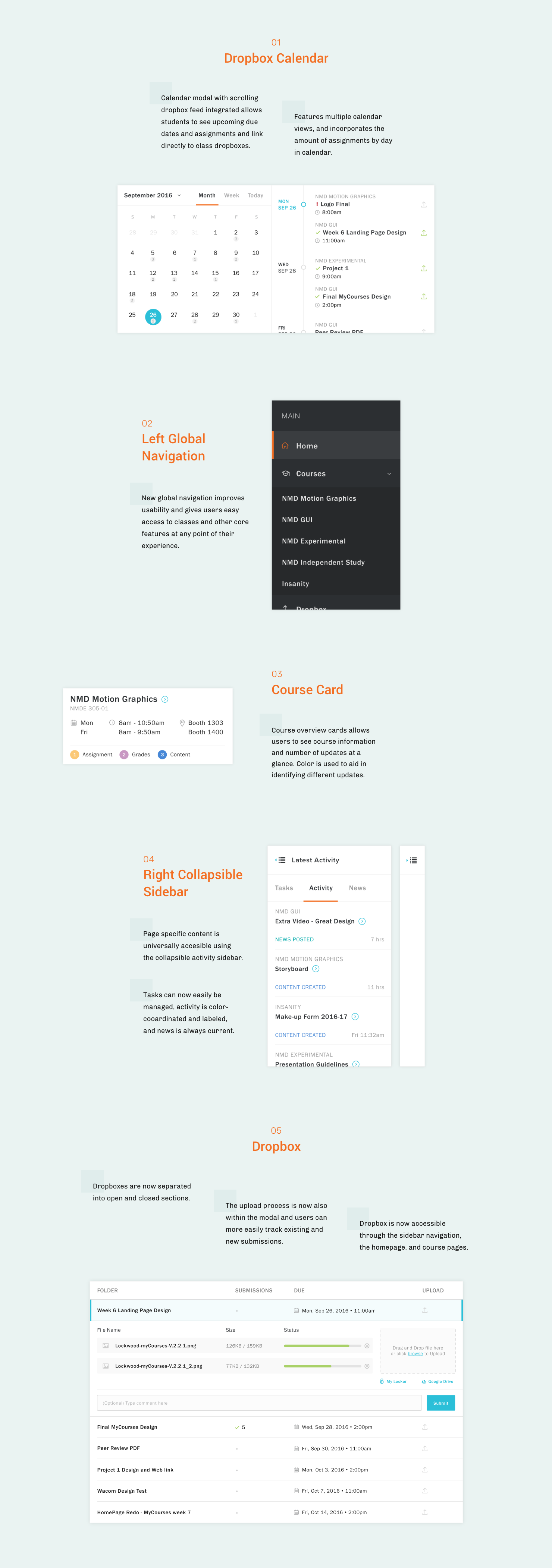
An intuitive experience which improves usability by balancing streamlined features and higher-level tools students use most with a distraction-free visual experience that inspires & supports RIT's mission to provide its community leading services.
FINAL VISUAL DESIGNS
OBJECTIVES
Goals
Minimize steps necessary to navigate the website and complete objectives.
Simplify interactions and clarify resources to encourage participation.
Advance channels of communication for more effective outreach and higher awareness.
CORE FEATURES
USER RESEARCH
Key Takeaways
By conducting user surveys and sharing findings I learned more about student experiences, needs, and pain points.
I received key feedback in three areas and many difficulties stemmed from usability and accessibility. These points helped guide my approach to innovating the platform.
50% of students feel course assignments & content are the most important features of myCourses.
20% of students feel dropbox is the most important feature of myCourses.
45% of students visit myCourses 10+ times weekly and 45% spend a max. of 2 minutes in the system.
INFORMATION ARCHITECTURE
WIREFRAMES
Iteration
My initial approach brings about several factors in need of improvement. Course assignments, course content, and dropbox were brought forth to provide higher level access to students but are spread out and seem unrelated.
The dashboard concept pushed my need to ensure the interface adapts to various devices. From here I move to a more dynamic approach that is more actionable, relevant, and flexible.
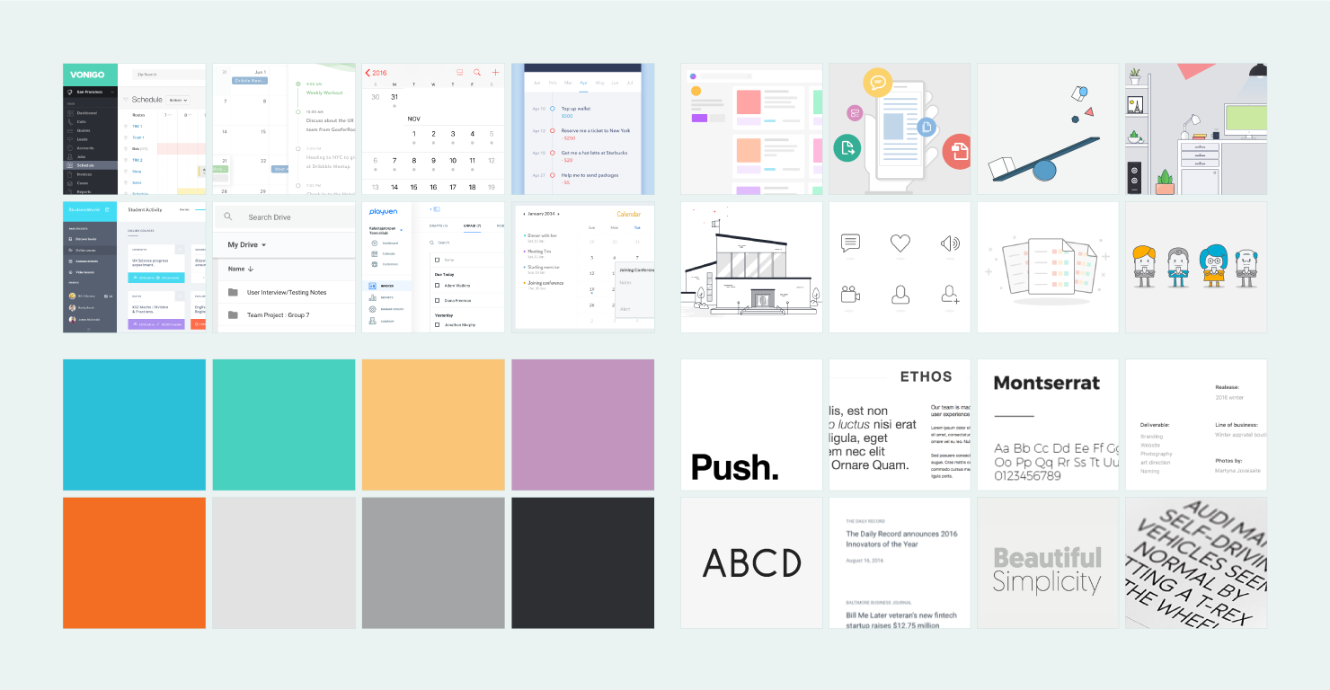
MOOD + STYLE BOARD
Direction
clean • approachable • simple • vibrant • bold
Great attention was given to creating an encouraging environment for focus, engagement, and productivity with positive hues and minimal elements.
FINAL VISUAL DESIGN
Pushing Academic Standards
My myCourses redesign invents an experience users would want to visit daily and aims to:
• Bridge gaps in student, faculty, and institute communication
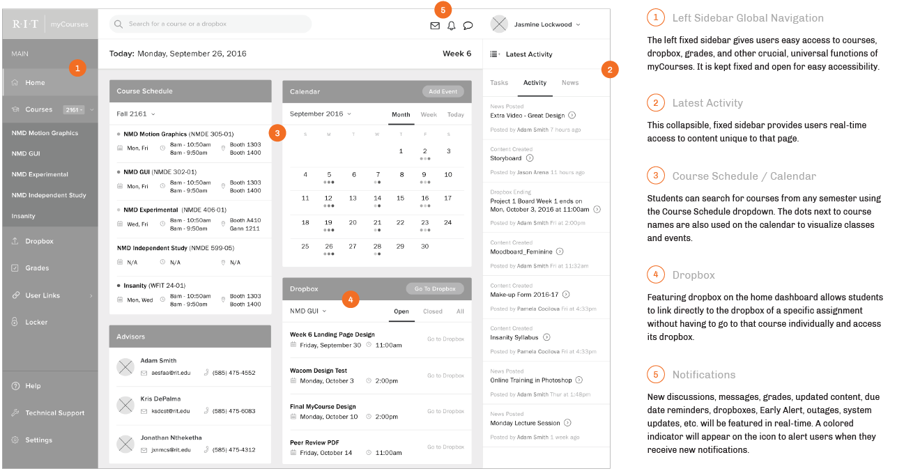
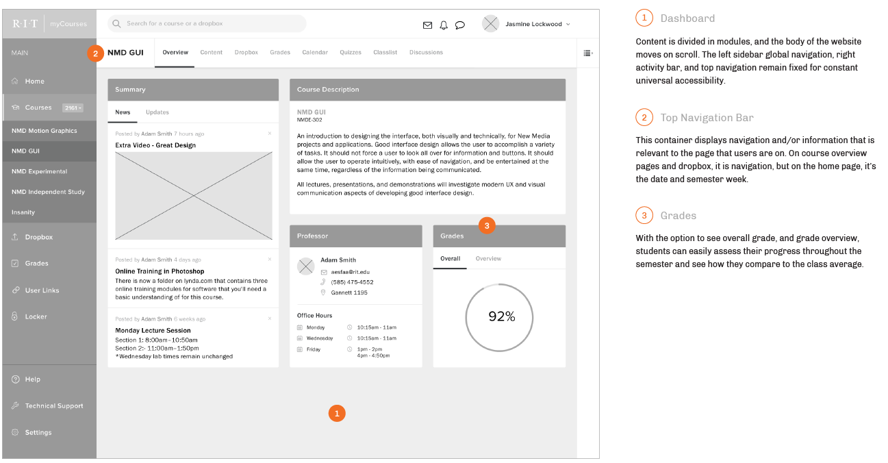
• Pull forward core features for an intuitive hierarchy that maintains familiarity and heightens trust
EXPLORE PORTFOLIO GALLERY


